DoorDash Dasher homescreen redesign
Sponsored by Samiksha Kothari and Gayatri Iyengar. I redesigned DoorDash's oldest Dasher homescreen and cleaned up 150+ scattered comms into one framework after too many cooks in the kitchen. Special thanks to Akhil Dakinedi. Full story here.
Scope
2024 to 2025. Rebuilt the Dasher homescreen across teams, systems, and platform surfaces.
My role
- Defined the new homescreen sheet pattern
- Simplified IA and core flows
- Unified 150+ Dasher comms
Impact
- Dashers started dashing faster after launch
- Saved ~$4M/year through better supply matching
- Made the homescreen faster to evolve
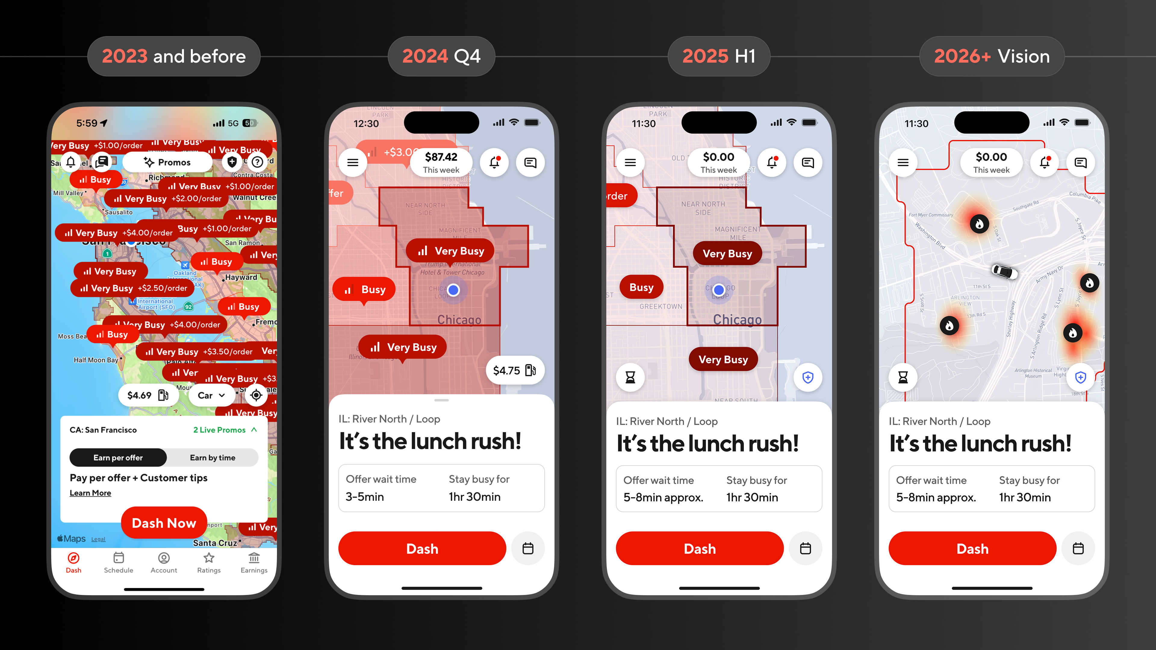
6+ months design. 9+ months development. We revamped the oldest homescreen in DoorDash history.
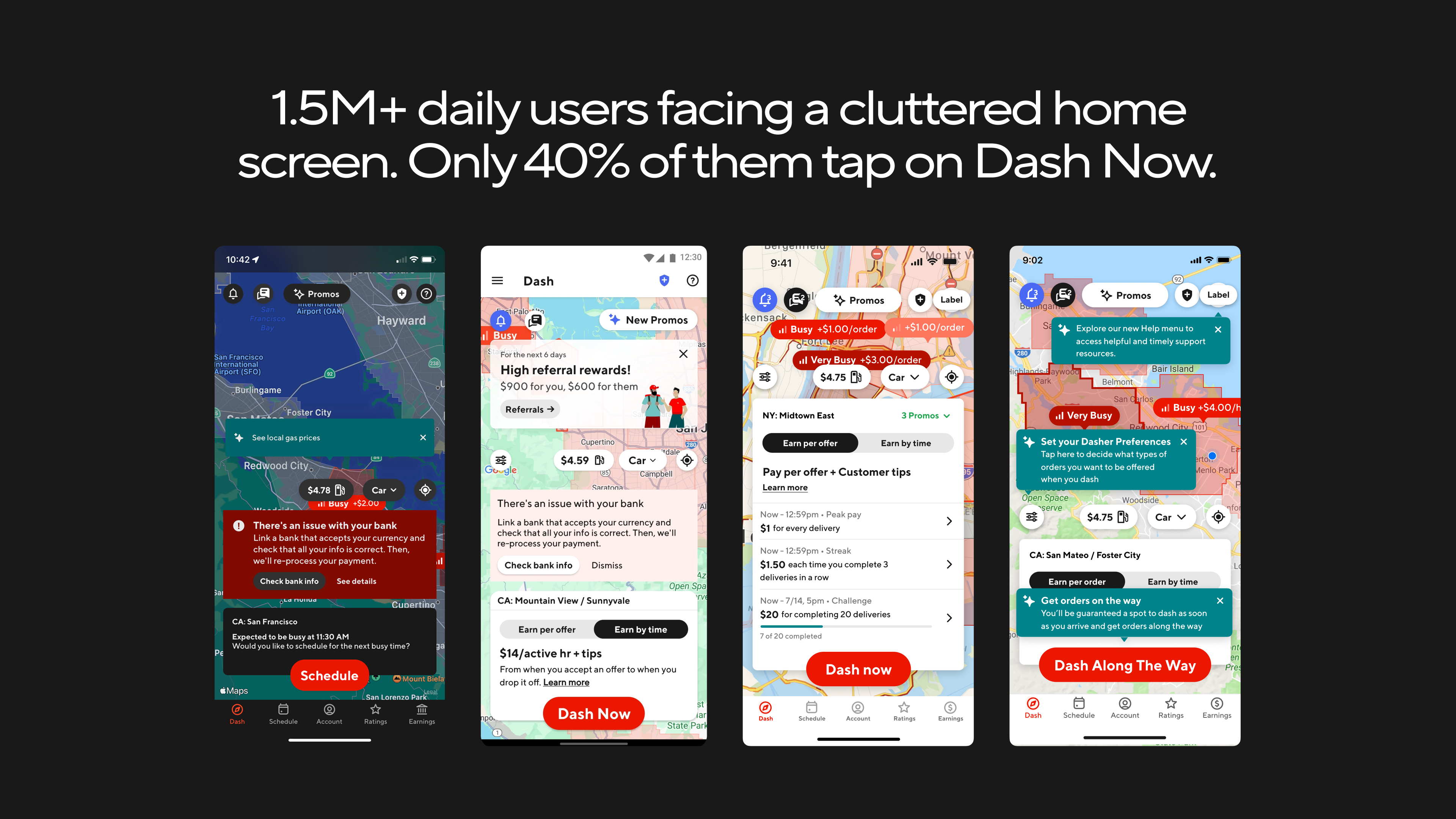
I spot the common system inside chaos, then map it end to end: before launch, I charted the full sheet map so every pre-online Dasher scenario had a clear home.
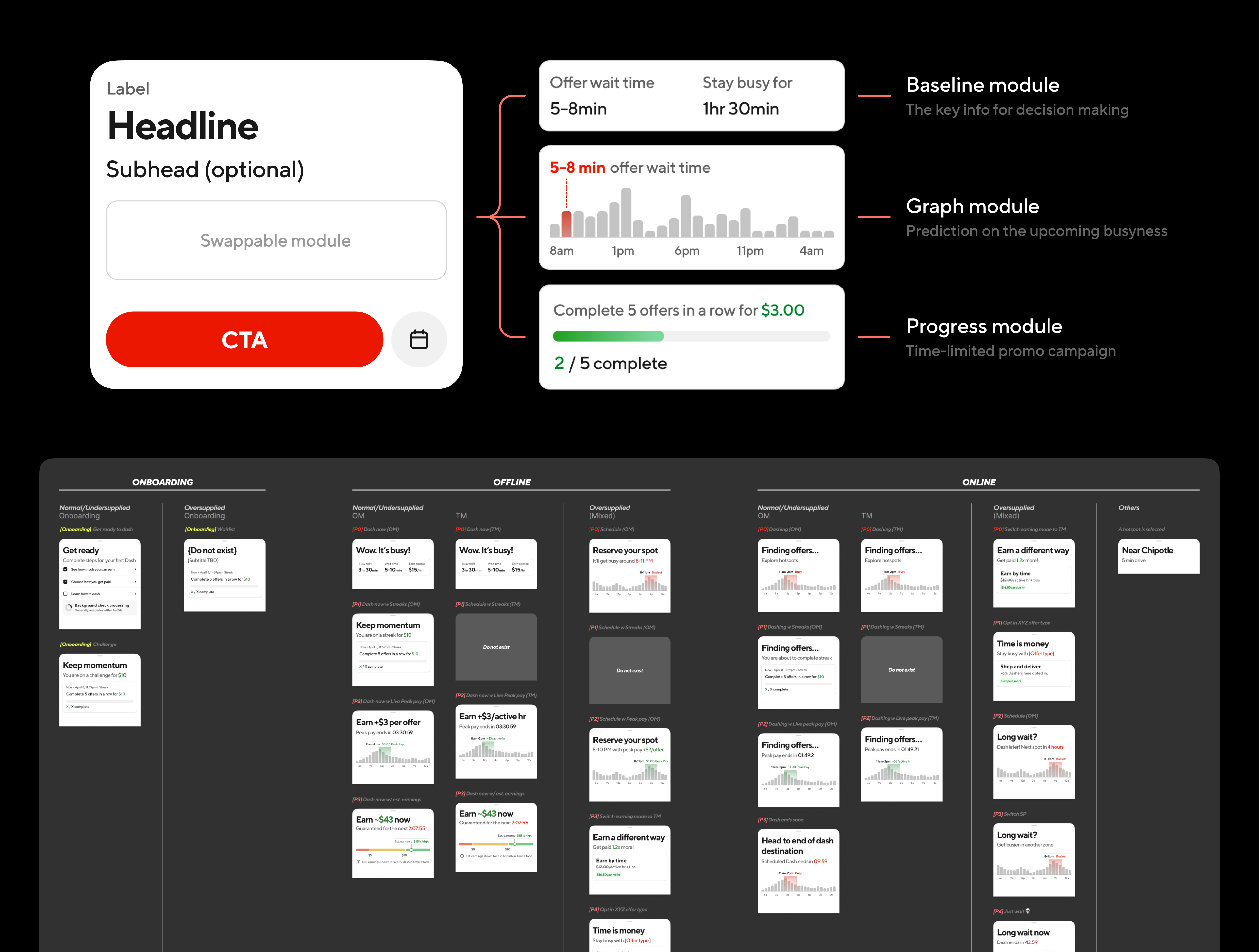
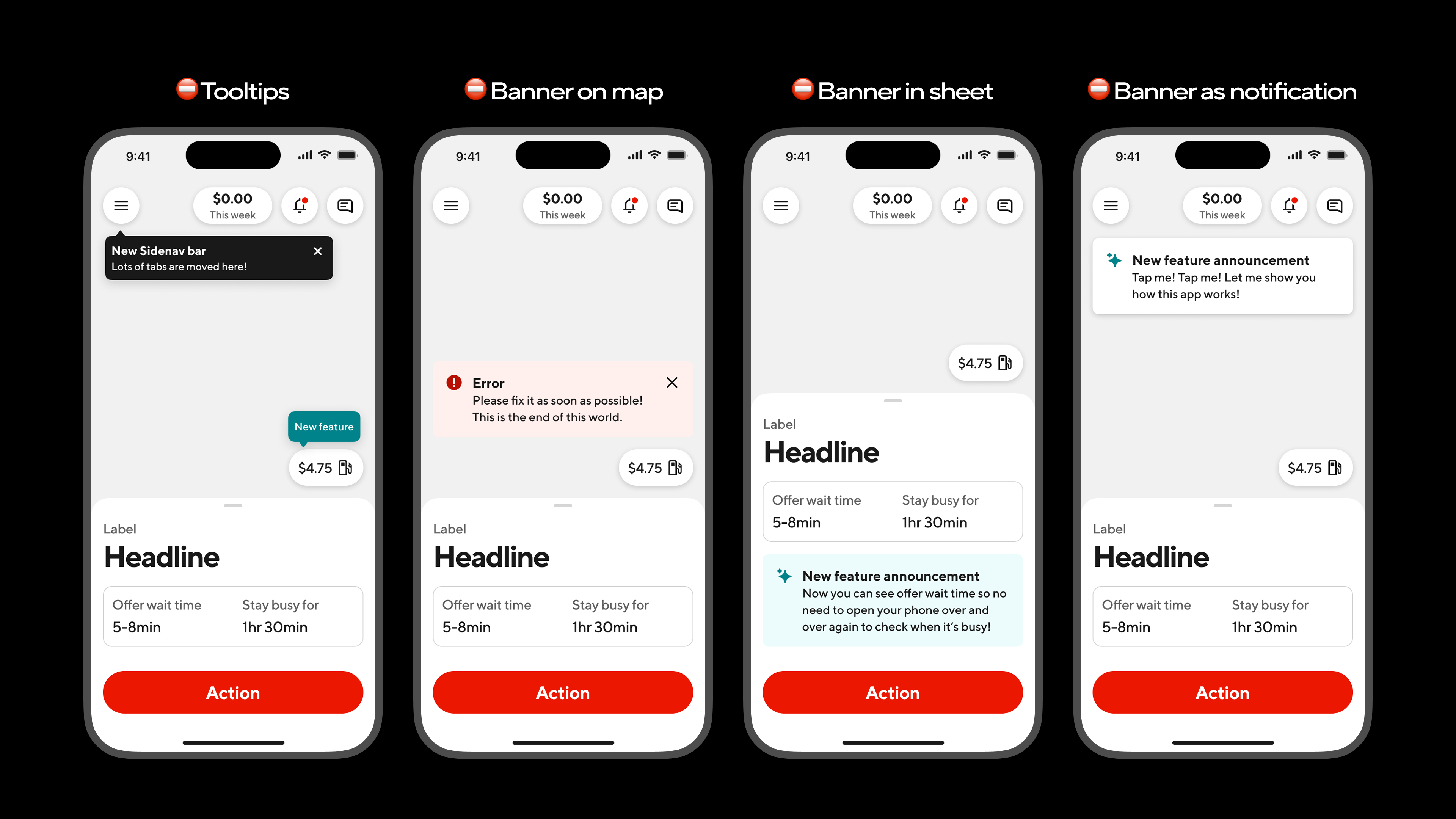
I cleaned house on legacy comms (tooltips, banners, pop-ups, all of it), then swapped them for a tight set of new templates, with rules for when each one belongs (and when it doesn't).
Better design = Better business
The new homescreen was officially launched in August 2025.
More dashers start dashing quickly
+6.9% (iOS) / +16.8% (Android)
150+ comms consolidated
Into one system
~4M/year saved
Better supply/demand match: less idle time, tighter efficiency.
10x increase in eng velocity
Homescreen became a scalable, experiment-ready platform.
More work
More from this site. Open a tile to read the story.